Wednesday, 3 October 2018

O to T - the penultimate blog post in my A to Z Art Business Glossary


 the A to Z continues with O, P, Q R S and T . . .


O is for Oregon (at the time that this was written, I was preparing for a three-day drawing workshop that I was leading in Portland, Oregon, USA).
 
I am passionate about drawing. A book is on the way, though slow progress as it is developing alongside teaching workshops, preparing for exhibitions, writing articles for Art publications, the day to day running of my business, keeping up with commissions (that is my income) oh and actually getting to do some painting once in a while! but meantime: The thing about drawing is that it should be enjoyable. Sketching in particular should be fast, immediate and about catching a moment that can be developed later or simply for the joy of capturing a movement and attitude.

"Most people think of drawing one way, as a linear outline, starting at the top and then continuing through the full silhouette. It is entirely possible to draw like this but it is a difficult approach not to mention narrow. Because the reality is that there are many ways to draw. 
In drawing workshops I ask people to work through a series of exercises based on Ten Approaches to Drawing, which was originally based on my life drawing experiences - if we use these approaches in Life Drawing, then why not apply them to other subjects?
The Ten Approaches (though there are actually many more than just ten) help to generate drawing ideas for beginners who are hesitant to explore and gives students with more background in drawing more ways to use their skills and discover and strengthen their natural style . . ."

You can read the rest of this online article, written for the ArtistsNetwork, here: https://www.artistsnetwork.com/art-mediums/drawing/10-different-drawing-approaches/


P is for Process.

(At the time of writing, my A to Z had been disrupted by B for Block, R for Real-Life and F for Feeling c***, but eventually came back with P for Process). 

The image is a painting 'Reflected Glory' from a few years ago with the sketches (yes I stood on the XC course at Burghley with my sketchbook and camera) and a couple of work-in-progress painting shots. If you look back to L for Life Drawing you’ll see how the 30 second warm ups help with drawing horses moving, and drawing horses moving helps with Life Drawing!


My creative process is to sketch from life or from my mind, then refine those drawings with (my own) photographic reference and use thumbnail sketches to work out a composition. Alongside that I often write in my journal about my thoughts and feelings about the subject – this is where seemingly random connections are made that help to move my ideas forward, so the writing is very personal ‘stream of consciousness’ type scribblings along with scribbled images – very cathartic, give it a go!


Some of my work and study (especially my Life drawing) is pure Process. Being concerned with Process not Product (I have to credit and early riding mentor: American classical dressage trainer Paul Belasik for that phrase), stops me becoming too focussed on the outcome and allows my creative back-brain to do more of the work. It is a form of Mindfulness – existing in the creative moment or like a sportsperson finding the ‘sweet-spot’ by being in ‘the zone’. It is a balance of thinking and not thinking, and finding the balance is always the hardest thing. But so worthwhile to keep trying.


Q is for Quarters
in my #atozruralbusiness #smallandsupercharged. My OH is always teasing me that I like to draw and paint horses’ rear ends - well as you can see not just horses! 


R is for Reproduction – already a blog post so follow the link to read the full copy . . .

This one took me a while for me to post. I was trying to cut the text to be able to post on instagram but failed in that endeavour so it had to become a blog post! The image is the proofing and quality checking for my ‘print’ (reproduction) ‘Breathe’. 

What most of us call prints are actually reproductions - to see some terms and explanations you can read the full text here:


S is for Sketchbook. 


I most always have a Sketchbook with me. For me it is where I go to sketch (obviously) both from life and ideas from my mind, to plan and develop drawings and ideas, to inspire myself, to lose myself . . . it is my Mindfulness and the only form of Meditation I have found that doesn’t make me want to scream and punch something.

My sketchbooks have won awards and are what people want to see at Open Studio events but are firstly an integral and vital part of my working creative process. 


Click on the vid to see a flick through of one of my current sketchbooks (I usually have 5 or more in various sizes on the go at any one time). You will see I have left blank pages where I will return to develop drawings into painting compositions, page markers for particular ideas and lots of writing. I also write and draw in a more personal journal every day. 

If you want to learn more I am leading an ‘External Mind’ Sketchbook Workshop for @pureartworkstudio in North Oxford, 30th to 31st October. 
https://www.pureartworkstudio.co.uk/workshops-by-ruth-bucha…


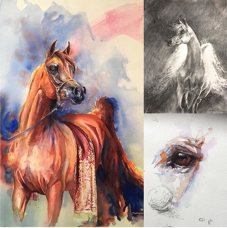
T is for Transitions

Transitions are the movements between areas of tone or colour in a painting – more commonly known as edges. As I continuing learning about painting I find that transitions  are more and more important to me and my work. I already knew this in drawing (and in dressage), but it has taken a while (years) for me to understand and apply this in painting. 

Where is a hard edge or strong transition of tone? Where is that edge softer, where is there no edge at all? Working solely from photographs makes this harder as a photograph tends to flatten and coarsen edges, but it is in that flow and rhythm of transition that the painting gains atmosphere, expression and interest, so my photographic reference is increasingly put away at key points in my painting to allow the piece to develop without being constrained by an external visual source - as in my watercolour painting and charcoal drawing of Arabian horses. I am also working more towards using no reference at all, as in this demonstration piece at the 2018 Great Yorkshire Show. 

It is all in the eye!


Monday, 24 September 2018

More A to Z - I, J, K L, M & N


I is for Inspiration (and for Improving)
Obviously I am inspired to paint by horses, but I am inspired to paint and draw BETTER by the work of artists throughout art history. I’m not talking here about the wonderful mentors and co-mentors I am lucky enough to know or have known, though they certainly play their part, but the ones in the books on my studio shelves. I remember exactly where I first saw their work. The artists that have inspired me the most work in different mediums, different styles and with different subjects (interestingly very rarely horses) but all have a quality of light capture, brushwork, mood and atmosphere, economy of mark or something intangible that speaks to me. Looking at their work has helped me out of many a painting quandary and many a painter’s block. So (among many and in no particular order) here is my list of go-tos: Edgar Degas, Franz Marc, Marc Chagall, John Singer Sargent, Horst Janssen, Katsushika Hokusai, Käthe Kollwitz, Ralph Steadman, Frank Auerbach, Egon Schiele, Felicien Rops, Joseph Zbukvic, Günter Grass. Which artists inspire you?  


J is for Just A Card. 
Designer Sarah Hamilton’s 'Just A Card' campaign started when she saw a quote from a recently closed Gallery’s owner saying that if everyone who had complimented the gallery had bought just a card they would not have had to close down. I can’t remember how many times I have said similar at a show! So if you like a gallery or artist and want to keep seeing their work then make a purchase at their shop, a show, or from their website to support them. Even small purchases add up so . . .  If you want to see or purchase my published work, you can at www.atlasart.co.uk or for more information about the campaign: https://www.justacard.org/


K is For Kismet. 
 ‘Kismet’ is my best selling print. The original (sold long ago) is a pastel study that I completed in 1995(!) using my friend’s mare Kizzy as a model. At the time I had not seen a painting or photograph that focused exclusively on the eye, but have seen many, many since. This does not stop me working on eye paintings and studies, but just makes me want to look for a different way of looking at the subject. The focus on the eye in 'Kismet' was not really deliberate on my part - I ran out of paper! You can buy the print at  http://www.atlasart.co.uk/equestrian-prints/kismet-horse-fine-art-print.html


L is for Life drawing. . .
I think anyone that knows me would know that in my world L is for Life Drawing (working from a nude human model). Anyone who thinks there is anything sexual or embarassing in that only needs to attend one class - they will very quickly get over themselves. Good Life Models are very skilled at what they do, often have an interest in art and usually have quite an Art Collection of gifted drawings by (often famous) artists. if you think it is easy, then try sitting still and holding a pose with energy and interest for 10 minutes. Some Life models can do that for over an hour. 
I have a passion for drawing and Life Drawing is THE BEST DISCIPLINE. From three minute, two minute or one minute warm up sketches and gestural drawings (see the top line of drawings) to 2 hour poses, it teaches proportion, mark making and helps to find a natural style. Life drawing, especially quick pose gestural work is very good practise for drawing animals, who have a tendency to not keep still, however much you ask them to. It helps to be able to find a good weekly class and I am lucky to have Andres Jaroslavsky @yorkcornerstudio nearby. Andres helped restore my confidence and has become a friend as well as a great tutor/mentor, knowing exactly when and how far he can push me to do better or go 'Faster Ruth, Faster!" (say in an Argentinian accent for the true effect). Life Drawing is my meditation, my mindfulness, my playtime, and my experiment zone . . . And we get chocolate with our cup of tea at halftime.


M is for Muse.

I have several muses for my art. In fact, of the nine muses in mythology, there is not a painting, or even an Art, muse - that role was down to a god(ess). For reference, the nine muses and their roles are:
Calliope - epic poetry
Clio - history
Erato - love poetry
Euterpe - music
Melpomene - tragedy
Polyhymnia - sacred poetry
Terpsichore - dance.
Thalia - comedy
Urania - astronomy


Mythologically speaking (at least in greek mythlogy) I work under the auspices of the goddess Athena, but am comforted that she was one of the most venerated of the Greek deities. Athena represented intelligence, creativity, enlightenment, and 'the arts', among many others that also included law and justice, strategic warfare and mathematics. The latter two I would say definitely feature in being an artist. Hephaestus, who was the Greek god of artisans and sculptors, did not see fit to include painting in his portfolio, though he did work as Blacksmith for Olympus. So us painters have to struggle on under a general 'the arts' goddess, However, I can probably claim Euterpe as a muse because I listen to music almost always when I paint or draw. My favourite band to paint to is . . . Muse (see what I did there?!). I do have pretty eclectic taste though, and a range of artists and musical genres feature in my itunes library. I have playlists for different stages of a painting: for bold, expressive brush-work; for smaller marks for detail work; to just get me going in the first place! Tapping into the music helps me to tap into the ‘zone’, where thought and feel work on a more instinctual level and the medium takes a larger role in the conversation between me and the paint. I have had people suggest that I have some synesthesia, which is the ability to see colour triggered by sounds. I am not sure I am that special, but I know that my best painting happens when I can over-ride the logical part of my brain and get into 'the zone' - see: Strategic Warfare.


N is for Narrative.


Some of my paintings and series are straightforward observational pieces but some have levels of narrative. This is planned out in great detail in my sketchbooks and preliminary work. I like books, films, music and artworks that work on different levels. In my own work, because the story and motivations are very personal I don’t like to force them on the viewer. Also I like the viewer to have their own relationship with the painting. The series ‘Innocence & Experience’ is a narrative series so let me show you a story . . . Just remember that Fairy Tales work on many levels! 


Tuesday, 18 September 2018

E, F, G & H - the second part of my A to Z Art Glossay


E is for Editorial
When I am not drawing or painting (not been riding much recently due to lack of horse!) then I am most often reading or writing. 

‘The Artist’ magazine published two of my articles early in 2018 following a previous demonstration article in 2014, and am currently working on a series of articles on drawing and painting horses and other animals to be published next year. Keep following my social media pages for updates. Facebook and @ruthbuchananart on instagram.

The online Art Magazine the ArtistsNetwork commissioned a general drawing article which was published in August 2018  . . . Oh and I have the long-term aim of writing a book . . . Or two . . . Or three! 


F is for Framing.
My good friend and mentor, Les Packham used to say that a good painting deserves a good frame and a bad painting needs one! It is true that the framing can make or break a painting. I am lucky to have worked with The Whole Picture Company in Harrogate for many years, having earlier experimented with cheap framing which is just a false economy. Art glass is now affordable and makes a huge difference to the clarity as well as being anti-reflective and UV protective. I use fine art grade lightfast materials and my prints are professionally printed using light fast inks but any pigment will fade over time in direct light. 


G is for Great Yorkshire Show. .

For the past few years I have been invited to exhibit in the Art Show, a gallery space on Avenue H. The gallery is staffed by the artists so people can also meet and talk to the creatives behind the exhibited artworks. We also get to have arty chats amongst ourselves and I have made some great artist friends through exhibiting at this wonderful opportunity.

We all owe a large debt of thanks to Judy Packham who has organised the Art Show since the start, originally alongside her husband Les.

Encouraged by Les and Judy, I did my first demonstrations at The Great Yorkshire Show and Les was always front and centre to watch, give me feedback and encourage me. Les was a fantastic watercolourist, a wonderful mentor to me and is hugely missed, though I still have his picture watching over me as I paint in my studio.  My image (above) shows my 2018 demonstration - a watercolour of a horse's eye. . . painted without reference!


H is for Horse Trials. 

I must have a thing about the letter B - I have sketched, painted and exhibited at Horse Trials at Burghley, Badminton, Blenheim, Burgham and Bramham (amongst others not beginning with B!).

The combination of dressage, cross country and showjumping set in beautiful parkland with the backdrop of stunning architecture has made a heady cocktail of inspiration for me for many years and I have shown some of the results of that around the picture of my Bramham Tradestand. Can you identify any of the horses or venues? No prizes, but feel free to answer in the comments.

Exhibiting is also a wonderful opportunity to meet the people who follow my work and make sales and commission bookings that will provide for me to keep on painting. 

Keep following - more  in the A to Z next week.


Wednesday, 5 September 2018

A to D in an A to Z Glossary of My Art Business

My blog has been quiet for a while but now I am back. . .

Earlier this year I took part in a #smallandsupercharged social media group A to Z about my business. Then I got really, really busy and it was sort of abandoned at T. I have since revived it, but thought I might post the whole A to Z (in manageable chunks) here for people to refer back to. So here is the first installment -  A to D:


A is for Art.
Some of my earliest memories are of something I made or drew, or a painting that captured my imagination and made me want to learn to paint. There is always more to learn and that is a great motivation. I have taken side-trips along the way, but the same things that inspired me then still inspire me now. 

Here are two examples. 
I destroyed most (over 100) of my sketchbooks but one survived the cull so you have drawings from 1982 of a polo player and a French street scene, and paintings of the same subjects from my more recent art practice. 


B is for Buchanimals. 
My own companions often act as model and muse. These are three much missed boys who shared our lives, and all of whom we lost in 2015/16. 

‘Whatever’ (top left) is our beloved Parsons Jack Russell, Riley, my studio companion who we lost far too early aged 11. 

‘Hawa My3a’ (bottom left - literal translation, ‘our muse’) is Boris. Just the most generous horse ever and whose huge heart finally gave out when he was 27. 

‘Counting Sheep’ (right) is my cathartic painting when I knew that my boy Atlas’ legs were failing after 20 years of a hugely active and enjoyable life together. I knew I had to let him go aged 23. 

We had all too short a time together but they live on in these paintings and our memories. Now the following generation of Buchanimals are providing the continued inspiration for paintings and making new memories. 


C is for Commissions.

Here I am not talking about the 40-70% commission that most Galleries or Agents take from a sale, but when someone asks me to paint their horse, dog . . . goats . . . cows . . .

This is my main income but also an inspiration and privilege in seeing first-hand, (and hopefully expressing in my art), the bonds between humans and their companion animals. 

I predominantly work from my own sketches and reference photos (plural). As well as the final painting, my clients get to keep the drawings they see to choose which ones goes forward to a painting. Most also have these framed as artworks in themselves. 


D is for Demonstration.

This image is my watercolour demonstration painting from a workshop in York. I still find demonstrating difficult - to focus on painting while being watched, and talk about process and technique at the same time - a big ask for an introvert more used to working in isolation! It is getting easier with practice and accepting that the painting will be looser and more akin to my painting from Life rather than my studio painting has helped.

The pencil below is a bit of the value sketch for this artwork. 

My thanks to Les and Judy Packham for encouraging me to demonstrate and teach. Les is much missed but his photo watches me paint in the studio and I know he is there in the front row (in spirit) every time I paint in front of people as he did in Life. 

Keep following my blog for more in the A to Z next week, and please comment below if you have enjoyed this post or want to have your own say, ask a question etc.


Thursday, 31 May 2018

R is for Reproduction


In my business A to Z, R is for Reproduction. I am talking about prints. This is what I have gleaned from my 17 years of working as a Fine Artist, but as with most things art, the terms are historical and most of the information is advisory which leads to all sorts of confusion. In actual fact what most people think of as prints are not ‘prints’ in Fine Art terms but reproductions. So here are a few terms and their meanings: 

‘Limited Edition Print’: in most instances you will see this to describe a reproduction of a painting or drawing which is limited to a specified number reproduced and each is numbered (eg 10 of 50 or 10/50) and signed by the artist. There should be no more reproductions made than the stated number (run) and any artists proofs, though the image could be reproduced in books or for the artist’s own marketing.
‘Open Edition Print’: as above but there is no finite run. Each one is signed by the artist but not numbered.
An unsigned ‘print’ is actually a poster!
‘Split Run’ a term used to show that an image is printed at more than one size. If this is within a Limited Edition then the total number of reproductions is still no more than the stated number. This is a newish addition and came in with the advent of Giclée presses.

None of the above is actually correct in Fine Art terms unless you substitute the word reproduction for the word print. However, people want to buy ‘prints’ not ‘reproductions’ so in marketing terms artists have to use these incorrect terms if we want to sell any and keep making a living!

Correct uses of the terms print and limited edition refer to non-mechanical printing – the production of a lino-cut, wood-cut, etching, monoprint, etc produced by hand by a fine artist. These artists now have to use terms like ‘original print’ or ‘hand-made print’ as the rest of us have usurped their terms.

Another Fine Art print process is Stone-Lithography. The advent of commercial presses for brochures, newspapers, books etc used a similar technique with metal plates termed Litho(graphy) and art prints were made by specialist printers using this type of press in larger runs, with a maximum of 850 for a Limited Edition. The artist oversaw and quality checked the production, seeing ‘galleys’ (sample prints) and writing remarks on them to instruct the printer of any changes. In the final edition they sometimes hand drew a smaller image on the side of the image which was termed a ‘remarque’ to make them more individual and to command a higher price. The Galleys could be kept as ‘artists proofs’ in numbers up to 10% of the print run and are numbered outside the print run A/P x of x. By convention the Artist’s Proofs are not sold, instead being retained by the artist or given away to friends and collectors. As such they are seen as more collectable.

Litho for Fine Art reproductions has now largely been supplanted by Giclée (literally means ink droplets) – basically a very high quality digital print out of an image on high quality paper and using inks that are ightfast pigment based inks rather than the dye based inks used in your desktop printer.  

This is a Giclée press - as you can see, much larger than a desktop printer!


Giclée ink suppliers state that, displayed under correct conditions and out of strong light (any pigment fades in strong UV light, including paint pigment), the inks should retain quality for 80 – 100 years. In addition, a proper fine art giclée printer will have their scanner and output machine recalibrated to their computer and monitor by an engineer at set up. Fine art repographers also recalibrate scanners to their computers monthly. The Artist should should still see and pass ‘galleys’ for quality before the final copies are produced, and the signature on each reproduction in the edition is a mark of that quality control. Some artists still issue Artist’s Proofs, either the true galleys, or additional to the print run. Make no mistake. There is an art to getting the reproduction to match the original as closely as possible. Good repographers are few and far between. They expend time and skill making sure that the reproduction is as close to the original as possible. After scanning and initial set-up I will spend at least 2 hours with the repographer matching and adjusting the galleys so that the colours, colour balance and saturation is as close as we can get to the original painting. I spend many hours getting the balances right in my painting and would hate to see that destroyed by inferior quality reproduction, which can change the focus and atmosphere of the images as well as the colours and tones.

Below is an image of the original and some of the galleys or proof prints for my painting 'Breathe'. The various proofs have very slight colour and balance differences. NB the angle of the photograph (taken on my phone) has produced some lens distortions that make the lower images look 'stretched) - in real life they are the same proportions as the (large image) original painting.


As with most things of quality there is a cost to that, and one which the artist has to spread across the whole edition, so a smaller print run will cost more both from the set-up/repro cost spread and as the prints are more limited and therefore more desirable. There is a trade off to the artist or publisher between Litho and Giclée. The former gives a cheaper unit price ie cost of each print, but the run must all be printed at one time so the full cost of all the prints is paid up-front and can take years to recoup. Giclées can be printed in much smaller batches – even ordered individually - but cost considerably more per unit.

Some paper manufacturers make ‘fine art’ ink jet paper that they specifically market for desk top printers, (like the one you have at home). Some artists mistakenly think it is therefore OK to print and sell their own editions. Hang one of these in even indirect light for a short period of time and it will fade pretty quickly to almost nothing.

So how do you know what you are buying? In short, the easiest way other than asking the right questions is the price. If it is ‘cheap’ it is probably not Fine Art quality. 

I would love to hear your views and experiences of prints and reproductions, so please feel free to comment below.